BRANDING
EXPERTISE
About the Client
Café Lavender is a small, women-owned café in Providence, Rhode Island with a focus on intentional, sensory-driven experiences. Built around the healing properties of lavender, the café offers a quiet escape from the everyday — where every drink, every detail, and every surface is designed to make you feel at ease.
client-First Approach
·
full brand identity
·
A Focus on Quality designs
·
client-First Approach · full brand identity · A Focus on Quality designs ·
The Challenge
Café Lavender needed a brand identity that could communicate warmth, calm, and sophistication all at once. The owner wanted something modern but soft — a visual language that felt as intentional as the experience inside the café itself.
The Approach
-

LISTEN & Plan with Purpose
The project started with understanding the feeling the owner wanted to walk into — calm, intentional, and welcoming.
-

BUILD THE IDENTITY
Logo system, color palette, and typography were developed together so every element felt like it belonged to the same world.
-

DESIGN EVERY TOUCHPOINT
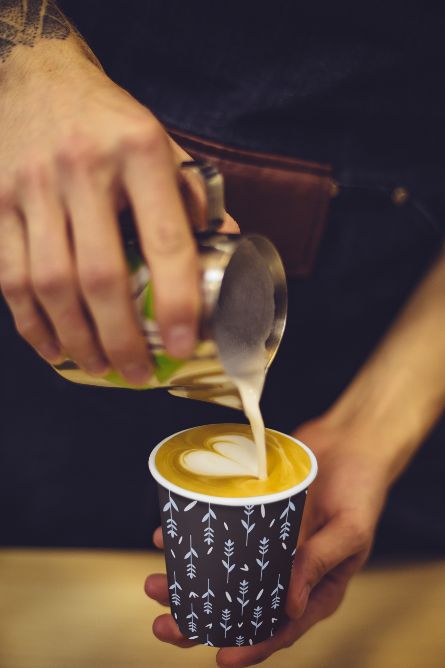
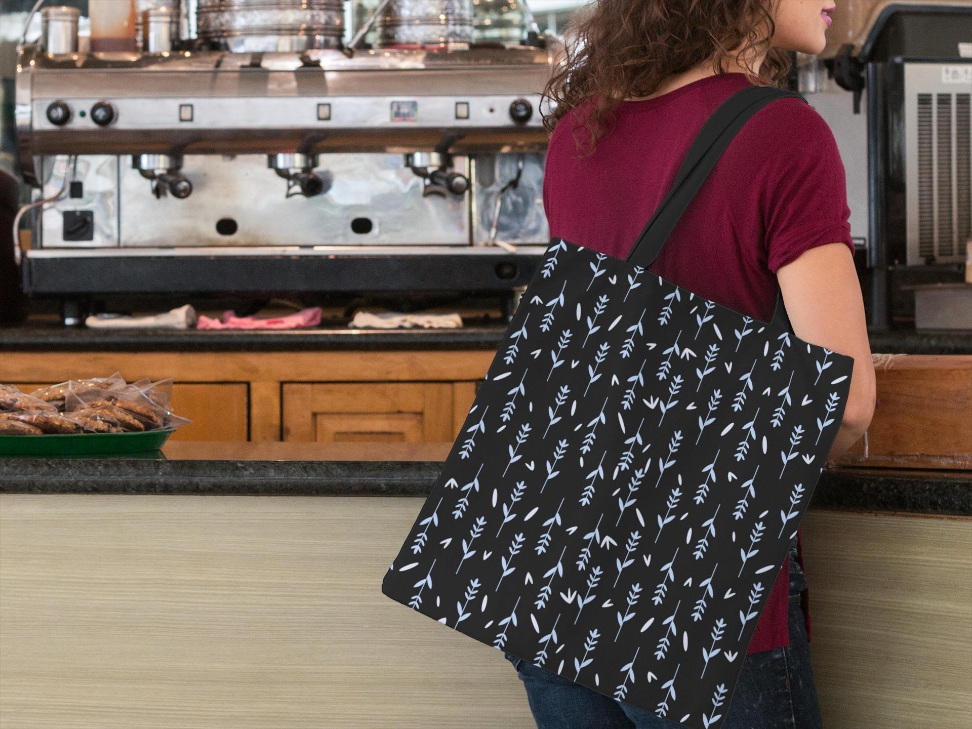
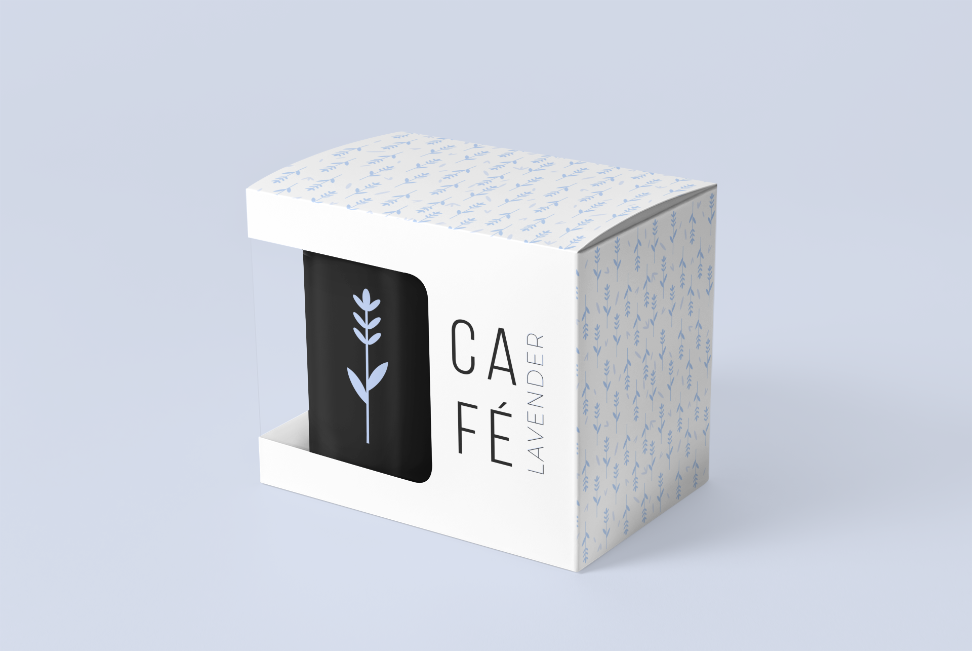
From the café menu to the packaging and brand patterns — no detail was too small to consider.
-

Deliver with Confidence
Every deliverable was designed to work together, so the brand feels cohesive whether it's on a cup, a sign, or a screen.

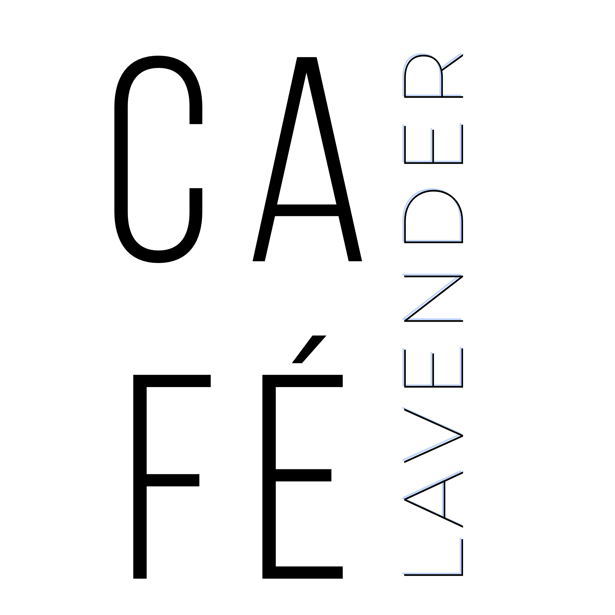
Identity
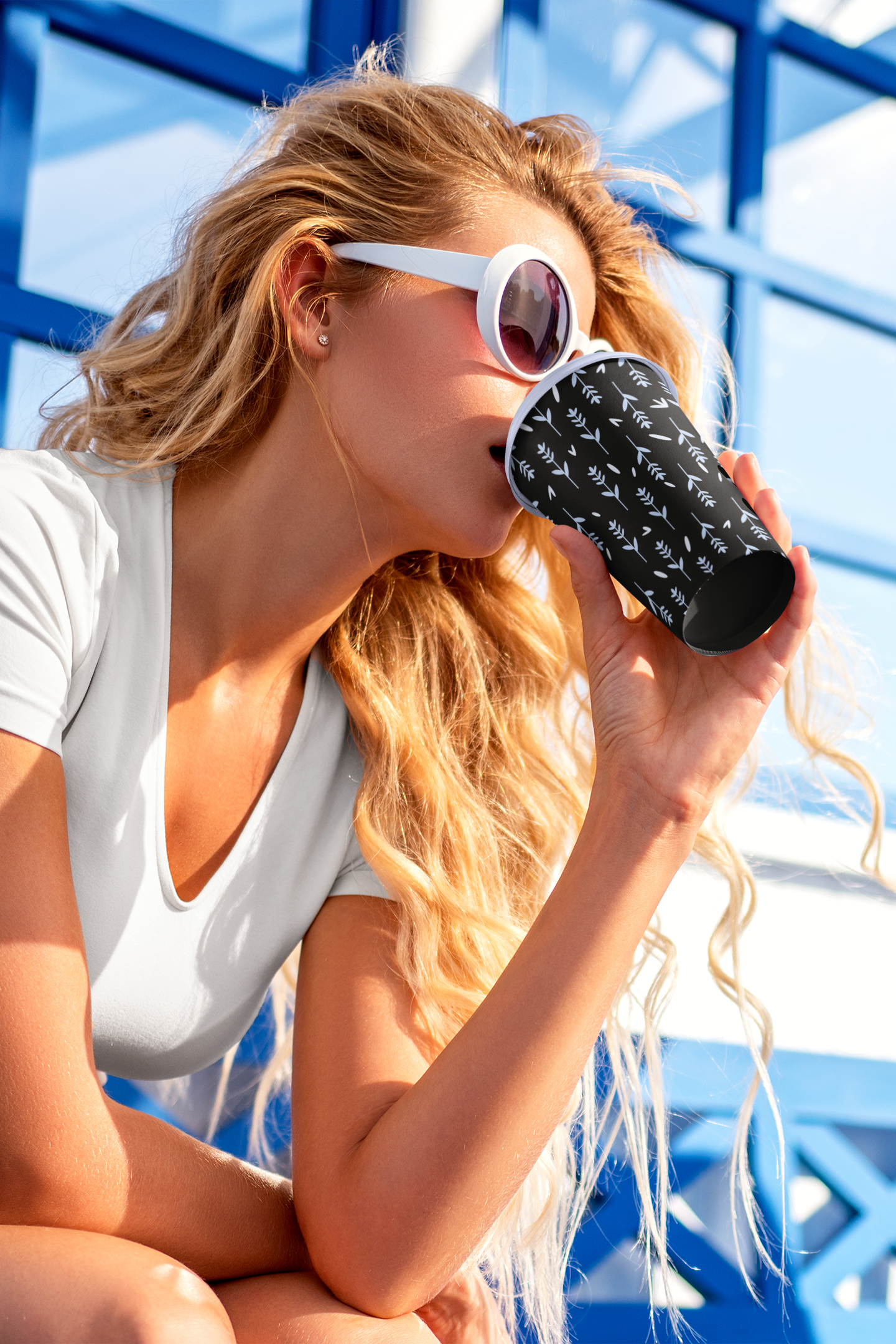
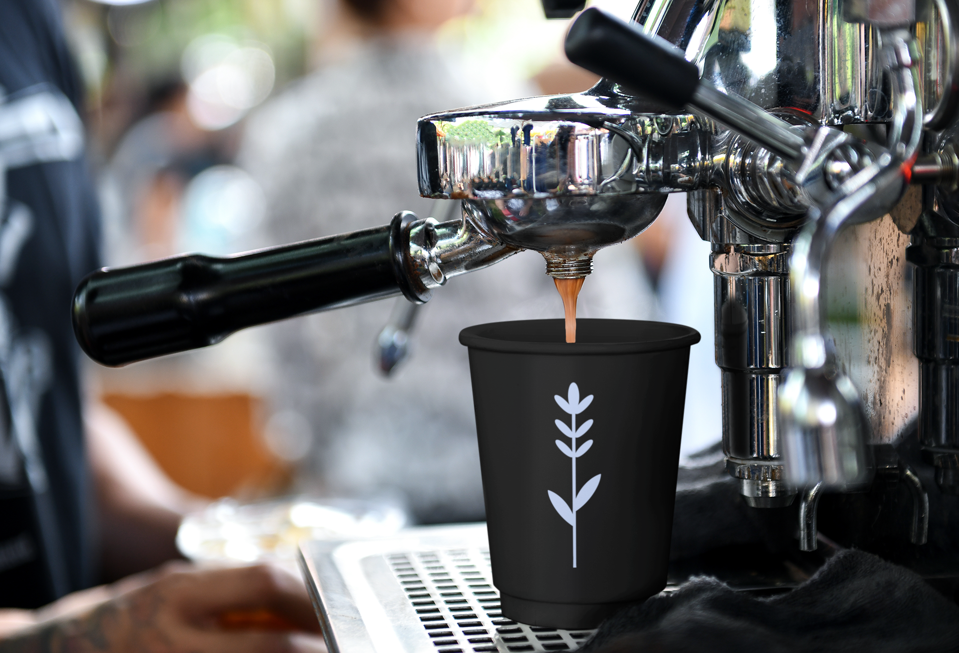
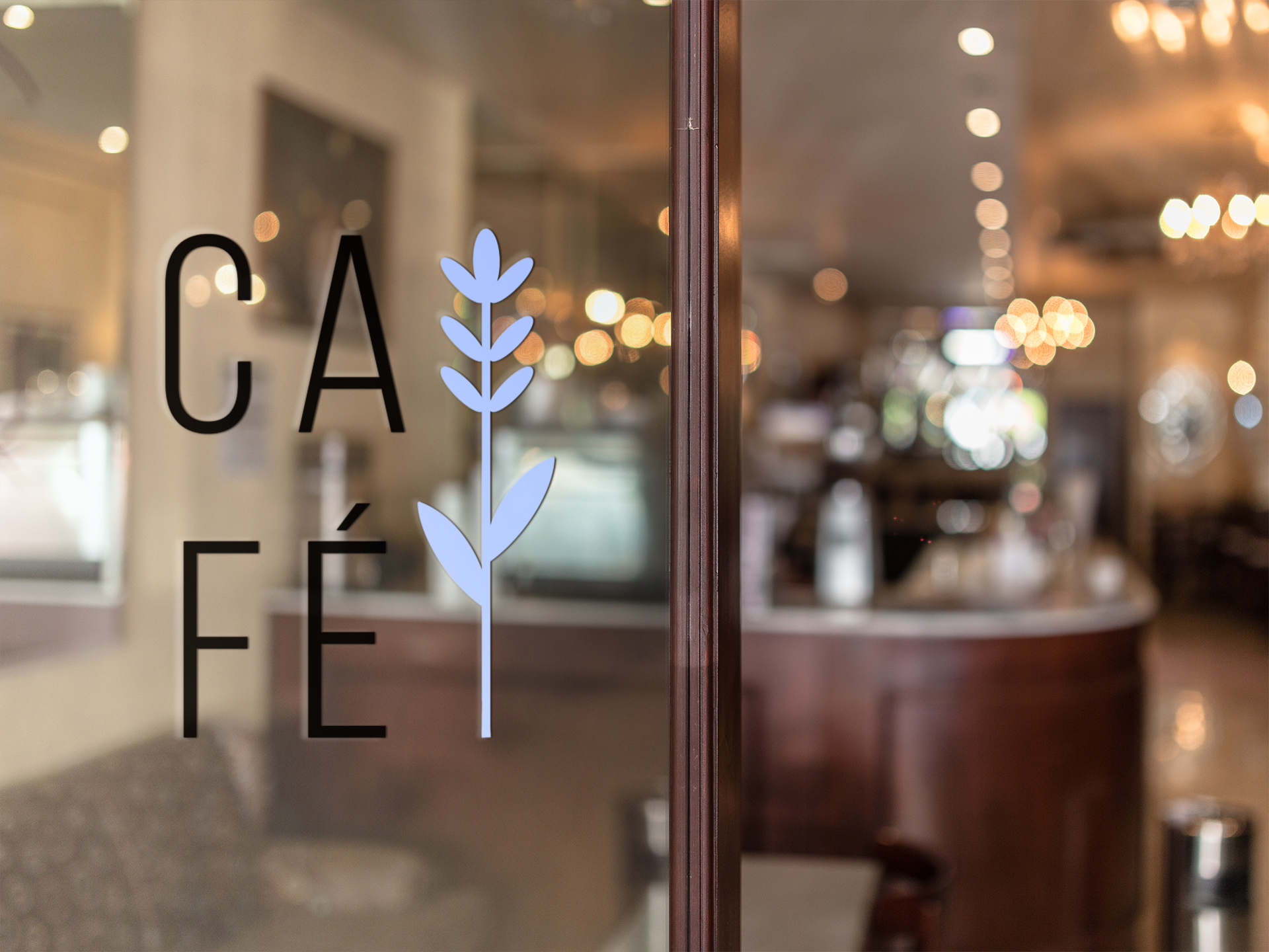
The identity was built around simplicity and restraint. A bold modern wordmark was paired with a delicate botanical submark to balance strength with softness. The color palette drew directly from the lavender plant — dusty purples, warm nudes, and deep blacks to ground it. Every touchpoint, from the menu to the packaging, was designed to feel like a deep breath.
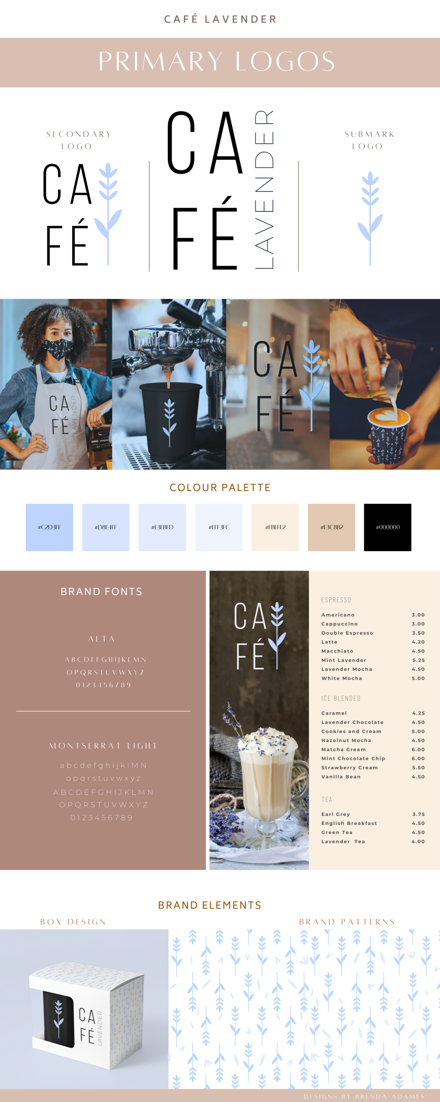
the logo
The Café Lavender logo system was designed with three variations — a primary logo, a secondary logo, and a botanical submark. Each version works together to create a flexible identity that feels cohesive across every surface, from signage to packaging
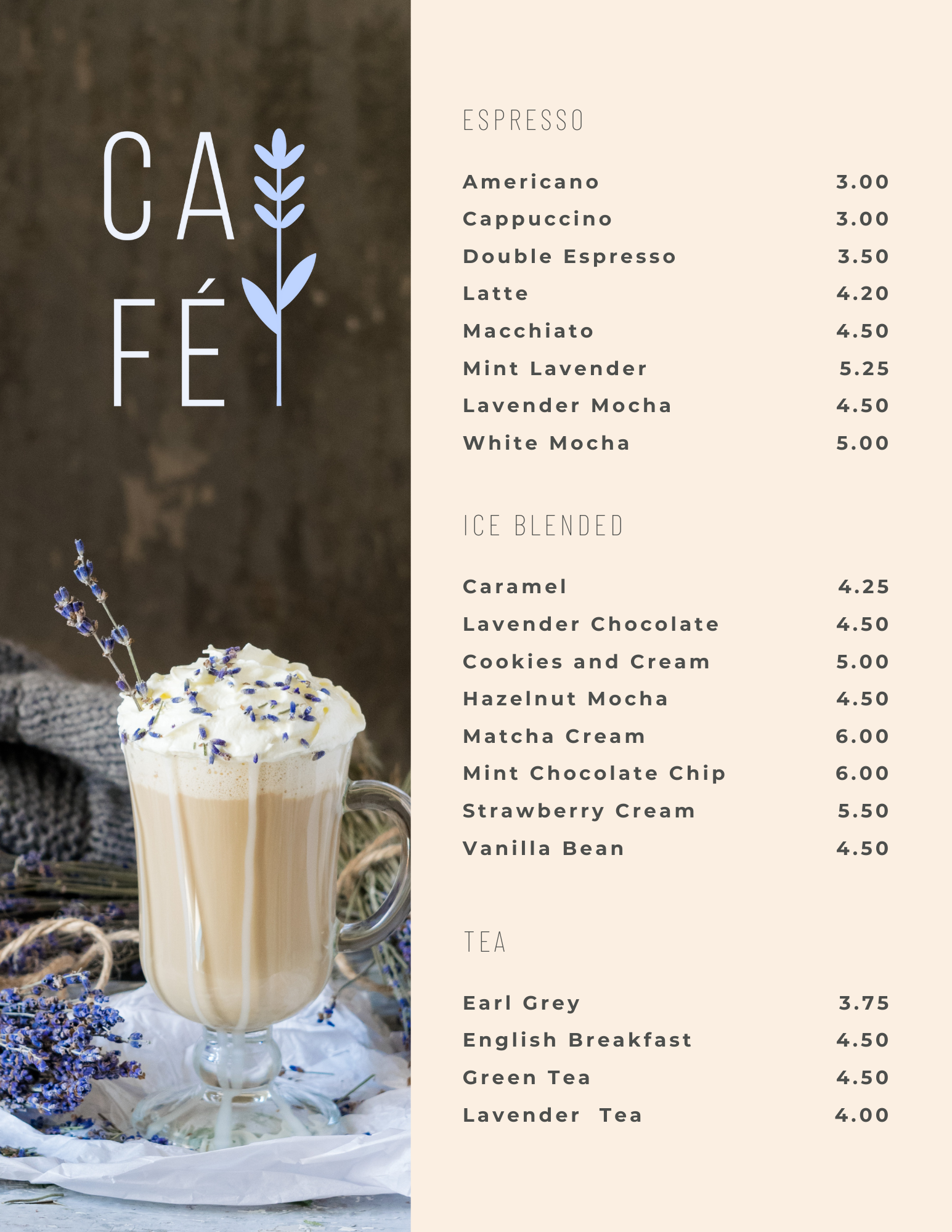
The menu
The menu carries the brand all the way through — same soft palette, same clean typography, same attention to detail. Because the experience should feel consistent before the first sip.